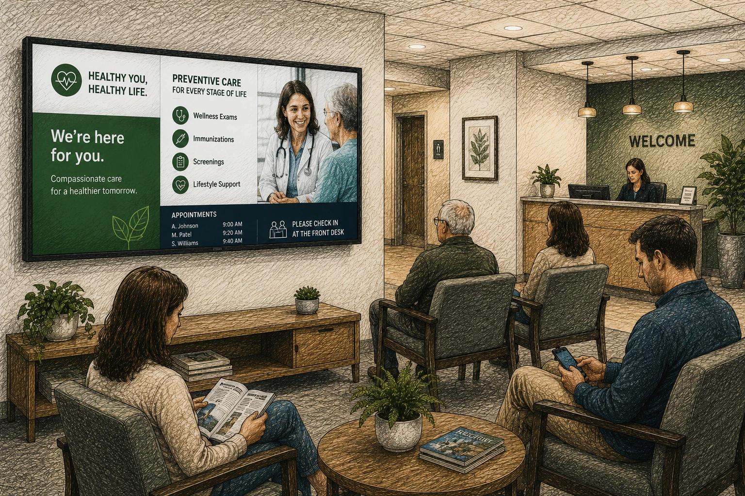
A waiting room gets judged fast. Before anyone speaks to your staff, visitors are already noticing whether the space feels calm, current, and organized. That is why strong waiting room screen content ideas matter more than most businesses realize. The right content does more than fill silence - it sets expectations, answers common questions, reduces friction, and makes the wait feel shorter.
The challenge is not getting a screen on the wall. It is deciding what should actually play on it. Too many businesses either run a looping slideshow that never changes or overload the display with promotions that people ignore. The most effective waiting room screens strike a balance between helpful, branded, and easy to maintain.
What good waiting room screen content should do
A waiting room screen has a different job than a lobby billboard or a retail promo display. People are usually stationary, somewhat attentive, and often looking for reassurance. They want to know where they are, what happens next, how long things might take, and whether there is anything they should do while they wait.
That makes utility the starting point. If your screen only pushes ads, it misses the moment. If it only displays generic visuals, it wastes attention. Useful screen content gives people a sense of direction, while branded content makes the experience feel more polished and intentional.
It also helps to think about perceived wait time, not just actual wait time. A five-minute wait with clear information and relevant content feels better than a three-minute wait with uncertainty. Good content reduces that low-level friction.
15 waiting room screen content ideas
1. Welcome and check-in guidance
Start simple. A welcome screen with clear check-in instructions can immediately reduce confusion. This is especially helpful in healthcare, service businesses, schools, and any front desk environment where people are unsure what to do first.
Keep this content brief and readable from a distance. If visitors need to sign in, complete a form, scan a code, or wait to be called, the screen should say so in plain language.
2. Real-time wait expectations
If your business can share estimated delays or appointment timing, do it carefully and clearly. You do not need airport-level precision. Even a simple message like "Running about 10 minutes behind" can lower frustration because people know what to expect.
This works best when updates are easy for staff to manage. If estimates are rarely accurate, it may be better to display process expectations instead of exact timing.
3. Frequently asked questions
The waiting room is a smart place to answer the questions your team hears every day. Payment methods, paperwork requirements, pickup timing, Wi-Fi availability, service steps, and return policies all fit well here.
This kind of content lightens the load on staff and gives visitors something useful to absorb while they wait. It also works well as rotating slides rather than one dense screen.
4. Service highlights
A waiting room screen is a good place to show what else you offer, especially when customers may not know the full range of services available. A dental office can highlight cosmetic options, a salon can feature premium treatments, and an auto shop can explain maintenance packages.
The key is relevance. Focus on services that make sense in that setting, not a long catalog of everything your business has ever offered.
5. Staff introductions
People tend to feel more at ease when they know who they are meeting. Short team profiles with names, roles, and friendly photos can make a business feel more personal and credible.
This is especially useful in healthcare, education, and professional services where trust matters before the first conversation starts.
6. Reviews and testimonials
Social proof belongs in waiting rooms because the audience is already considering your service in real time. A few well-designed customer quotes can reinforce confidence without feeling too promotional.
Avoid turning this into a wall of five-star clichés. Use short, specific testimonials that sound real and reflect your actual strengths.
7. Process explainers
People are calmer when they understand what happens next. Use your screen to walk visitors through the appointment, intake, service, or pickup process. For example, a clinic can explain visit steps, while a repair shop can show how diagnosis and approval work.
This is one of the most practical waiting room screen content ideas because it prevents uncertainty before it starts.
8. Educational content
Educational content works well when it is tightly connected to the visitor's reason for being there. A medical office might share seasonal wellness tips. A church office might display upcoming ministry information. A school front office might share attendance reminders or family resources.
The content should be useful in short bursts. Think quick insights, not lectures.
9. Promotions with timing and context
Promotions can work in waiting rooms, but they should not dominate the whole playlist. If every slide is a discount, the screen starts to feel like an ad loop.
A better approach is to mix promotions into a broader content rotation. Highlight one or two offers that are timely, relevant, and easy to act on. Seasonal services, add-ons, or limited-time reminders usually perform better than generic sales messaging.
10. Seasonal or local updates
Freshness matters. Even strong content loses value if it never changes. Seasonal messaging keeps your screen feeling current, whether that means holiday hours, weather-related reminders, back-to-school notices, or local event tie-ins.
This kind of content signals that the business is active and attentive. It does not have to be complex to be effective.
11. News and curated live feeds
For some environments, a light stream of news, weather, headlines, or community updates can make the space feel alive. This works best when the content is easy to read and not overly distracting.
There is a trade-off here. Live feeds create freshness, but too much motion or irrelevant information can make the screen feel noisy. The setting should guide the choice.
12. Appointment prep reminders
If visitors need to prepare for the next step, your screen should help them do that. This could include reminders to have insurance cards ready, complete intake forms, silence phones, gather documents, or confirm vehicle details.
These prompts are small, but they improve flow in ways that staff will notice quickly.
13. Brand story and values
A waiting room can be a good place to communicate what your organization stands for, especially if trust and mission are central to the experience. That could mean your approach to patient care, your service standards, your community involvement, or your history.
This content works best when it feels grounded. Visitors do not need a brand manifesto. They need a simple sense of who you are and how you operate.
14. Wayfinding and next-step instructions
In larger facilities, visitors often need more than a welcome message. They may need directions to restrooms, service counters, classrooms, treatment areas, or pickup zones. Clear on-screen wayfinding can reduce interruptions at the front desk and help people move through the space more confidently.
For multi-location organizations, standardized wayfinding content also creates a more consistent experience across sites.
15. Calm visual content with purpose
Sometimes the best content is not another block of text. Clean visuals, subtle motion, or branded ambient content can make a space feel more modern and less tense. This is especially useful in waiting rooms where anxiety runs high.
The important part is purpose. Calm visuals should support the environment, not replace useful information altogether.
How to choose the right mix for your screens
The strongest waiting room screen content ideas usually combine three things: information, reassurance, and light promotion. If you lean too far in one direction, the screen becomes less effective. Too much utility can feel cold. Too much promotion can feel self-serving. Too much passive content can feel forgettable.
A practical content mix for many businesses is to lead with helpful information, rotate in trust-building content like reviews or team intros, and then add a lighter layer of promotions or updates. That balance keeps the screen useful without making it feel static.
Your audience also matters. A pediatric office, a tire shop, and a university reception area should not run the same playlist structure. The setting, average wait time, stress level, and visitor intent all shape what people are likely to notice.
Three waiting room playlists you can build
Use these examples as starting points, not fixed rules. Each playlist has six slides and a 90-second loop. The timings are suggestions: lengthen slides if visitors cannot comfortably read them from their seats. Keep essential check-in instructions visible elsewhere as well, so someone arriving halfway through the loop knows what to do.
1. Clinic or dental waiting room
Aim: explain arrival and appointment steps without filling the screen with dense instructions. Use general information; keep patient names, appointment details, and other private information off the public playlist.
- Welcome and check-in — 20 seconds. Example: “Welcome. Please check in at reception, then take a seat.”
- What happens next — 15 seconds. Explain the next step in your actual process, such as waiting for a team member to collect the visitor.
- Meet the team — 15 seconds. Show one staff photo, name, role, and a short introduction.
- Common question — 15 seconds. Answer one practical question, such as where to find the restroom.
- Office update — 10 seconds. Show current opening hours or an upcoming closure.
- Calm visual — 15 seconds. Use a still landscape or a simple branded welcome slide.
Example layout to recreate: put your logo in the upper-left corner, a large “Welcome” heading below it, and the check-in instruction in the main area. Use a narrow bottom strip for “Need help? Ask reception.” Give the instruction most of the screen rather than competing with several panels.
2. Auto repair shop waiting area
Aim: explain how the visit works and answer questions customers would otherwise need to ask at the counter.
- Welcome and next step — 20 seconds. Example: “Please check in at the service desk. We’ll confirm your vehicle and contact details.”
- Service process — 15 seconds. Example: “Inspection → estimate → your approval → repair.” Only show steps that match your shop.
- Wi-Fi and facilities — 15 seconds. Provide your guest network details and restroom directions, if available.
- Service explainer — 15 seconds. Explain one service in plain language, using an image where it helps.
- Current offer — 10 seconds. Show the price, terms, and expiry date for one valid offer.
- Pickup instructions — 15 seconds. Explain where to pay, collect keys, or ask for an update.
Example layout to recreate: use a large service photo on the left and a short headline with up to three supporting lines on the right. Put the service desk’s location in a consistent footer. Keep offers on their own slide so they do not compete with process instructions.
3. Office reception or coworking space
Aim: help visitors find their host and understand how to use the space.
- Welcome and check-in — 20 seconds. Example: “Visiting today? Please check in at reception.”
- Finding your host — 15 seconds. Explain who visitors should contact and where to wait.
- Wayfinding — 15 seconds. Show a simple floor map or clear directions to the meeting rooms and restrooms.
- Guest amenities — 15 seconds. Show guest Wi-Fi, refreshments, or other facilities that are actually available.
- Today’s public event — 10 seconds. List only events intended for visitors; substitute office hours when there is no event.
- Team or community introduction — 15 seconds. Feature one team, member business, or community announcement.
Example layout to recreate: place a large “Welcome to [your space]” heading across the top. Below it, use one area for check-in instructions and another for directions. Keep confidential meeting titles and visitor details out of the public display.
How long should each waiting room slide stay on screen?
Start with 10–20 seconds for a short slide, then test it in the room. A slide with directions or a longer message may need more time. If you need a long hold just to make the text readable, split the content into separate slides or shorten it.
For the sample playlists above, 20 + 15 + 15 + 15 + 10 + 15 seconds creates a 90-second loop. Avoid padding a playlist simply to match the average wait: visitors arrive at different points, and they may need an important instruction before the loop comes back around.
- Read every slide from the furthest seat. Increase type size or reduce words when needed.
- Use a clear headline and one main message. Avoid fast scrolling text and rapid transitions.
- Start with muted playback. Add audio only if it serves the room and staff can manage it.
- Watch a full loop on the actual screen before publishing it for visitors.
Keep it easy to update or it will go stale
This is where many screen strategies fall apart. The initial content looks good, but no one owns updates, so the playlist ages badly. A holiday slide stays up in February. A promotion ends but keeps running. Staff stop trusting the screen, and visitors stop reading it.
The better approach is to build content around a mix of evergreen slides and easy-to-refresh sections. Core instructions, FAQs, and service explainers can stay in place longer. Promotions, announcements, and seasonal messages should be simple enough to swap out quickly.
For teams managing one location or fifty, ease matters more than ambition. A screen that updates consistently will outperform a more elaborate setup that becomes outdated. That is one reason modern digital signage tools like HipDeck are gaining traction - they make it much easier to keep content fresh without adding another complicated system to manage.
A simple maintenance routine makes the playlist easier to keep accurate:
- At opening: check the screen is playing, the welcome instruction is correct, and time-sensitive updates are current.
- Each week: review offers, hours, staff introductions, and guest information. Remove anything that no longer applies.
- Before a closure or event: add the new message and set a reminder to remove it afterward.
- Assign one owner and a backup so updates do not depend on whoever notices a stale slide first.
A waiting room screen does not need to do everything. It just needs to make the time people spend with you feel clearer, calmer, and more intentional. If your content helps visitors know what to expect and gives them a reason to trust what happens next, the screen is doing real work.
Build your first waiting room playlist in HipDeck
Choose one of the examples above and start with six simple slides. You can build slides in HipDeck’s editor or upload artwork you already have. Give the playlist a location-specific name, such as “Front Desk — Visitor Welcome.”
Create your first playlist: step-by-step guide
Set the slide durations, arrange them in order, and preview the complete loop. Open the HipDeck player on a supported display device, then enter its pairing code under Screens in your dashboard. Assign the playlist, publish it, and check the physical screen from the seating area.
If content needs to change between morning and afternoon, create separate playlists and use a schedule. Test the changeover and make sure useful content remains available throughout your opening hours.
During the trial, test a full visitor journey: arrive halfway through the loop, find the next step, read the smallest text, and check how staff update a message. HipDeck’s 7-day trial includes one screen and requires no credit card; check the current pricing before adding paid screens.