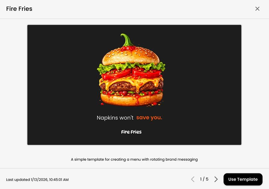
Every screen starts with the same question: what goes here next? That is why digital signage content templates matter. They turn blank screens into repeatable, usable communication tools, which is exactly what busy teams need when they are managing promotions, announcements, menus, events, and internal messaging across one location or many.
Templates are often treated like a design shortcut. They are that, but they are also an operations tool. A good template reduces decision fatigue, keeps content consistent, and makes updates faster for people who are not designers. For a restaurant manager changing a lunch special, a school administrator posting reminders, or a multi-location operator updating seasonal promotions, that difference adds up quickly.
What digital signage content templates actually do
At a basic level, templates give you a starting structure for recurring content. That might be a weekly promotion layout, a church announcement slide, a waiting room information screen, or a staff communication panel. Instead of rebuilding each piece from scratch, your team works from a format that already has the right spacing, branding, hierarchy, and content zones.
The real value is not just speed. It is consistency under pressure. Most organizations do not have a full-time designer assigned to every screen update. Content is often handled by marketers, managers, office staff, volunteers, or operations teams who have ten other things to do. Templates make good content more likely, even when time is limited.
They also create a system for scale. One screen is easy to manage manually. Ten screens across several locations is not. Once content starts moving across departments or sites, inconsistency becomes expensive. Fonts change, logos get stretched, messages get crowded, and important information gets buried. Templates solve for that by giving everyone the same starting point.
Why some templates help and others create more work
Not all digital signage content templates are useful. Some look polished in a preview but fall apart in day-to-day use. Usually that happens when the template is too rigid, too decorative, or built without a clear purpose.
A strong template begins with screen behavior, not just appearance. People glance at screens. They do not read them like a brochure. That means the layout needs to support fast comprehension. Headlines should be easy to scan, supporting text should be minimal, and visual contrast should do some of the communication work.
The best templates also account for who updates them. If every edit requires design judgment, the template is not doing enough. Good templates make the right choices feel obvious. They include placeholders that guide content length, image areas that fit common asset sizes, and layouts that still look clean when updated by a non-designer.
There is a trade-off here. Highly branded templates can create a polished look, but they may be harder for distributed teams to adapt. More flexible templates are easier to reuse, but they can lose some visual sharpness if too much is left open-ended. The right balance depends on how many people touch the content and how often it changes.
The most useful template types for real-world screen programs
Most organizations do not need dozens of template styles. They need a practical set that covers recurring use cases. In many cases, five to eight templates can support the majority of screen updates.
Promotional templates are common for retail, restaurants, hospitality, and service businesses. These usually need a strong headline area, one clear image or product visual, and space for pricing or a short callout. They work best when there is one main message, not a stack of competing offers.
Announcement templates are useful across schools, churches, workplaces, and healthcare settings. These should prioritize readability over visual complexity. Date, time, location, and action details need to be immediately visible. If viewers need to study the screen to understand it, the template is carrying too much.
Menu and pricing templates need another kind of discipline. They often hold more information than promotional screens, so hierarchy matters even more. Categories, item names, pricing, and limited-time callouts should be easy to separate at a glance. A stylish layout is helpful, but clarity has to win.
Event templates are slightly different because they often serve both awareness and urgency. A future event needs visual appeal, but a same-day event needs fast clarity. One template may not serve both situations equally well, so it can make sense to build separate versions for advance promotion and day-of reminders.
There is also growing value in templates for live or dynamic content. Weather, social feeds, dashboards, countdowns, and calendar-driven messages still need a visual frame. The template may be simpler, but it should still define spacing, branding, and how changing data appears on screen.
How to build digital signage content templates that stay useful
The smartest way to build templates is to start with repetition. Look at the content your team publishes most often, then identify patterns. If you are constantly posting weekly offers, service reminders, event notices, and branded welcome screens, those are your template priorities.
From there, focus on layout rules before decoration. Define headline size, image area, logo placement, color usage, and how much text each section should hold. That keeps the template usable even when the content changes.
It also helps to think in terms of zones. Many strong templates have a simple structure: a primary message area, a supporting detail area, a branded anchor, and an optional visual element. This makes updates predictable and reduces the urge to redesign every screen from scratch.
Template naming matters more than people expect. A clear internal system like Promo - Full Screen Image, Announcement - Text First, or Menu - Three Column keeps teams from guessing. If users cannot tell which template to choose, they will either waste time or choose the wrong one.
One practical rule is to test templates with real content before rolling them out widely. Placeholder copy is forgiving. Actual promotions, real event details, and unevenly sized images reveal where a layout breaks. A template that only works under perfect conditions is not ready.
Design choices that improve screen performance
A template should look good, but on digital signage, performance matters more than ornament. Clear contrast, restrained text, and obvious hierarchy generally outperform busy layouts. This is especially true in environments where viewers are moving, distracted, or several feet away from the display.
Typography is one of the biggest factors. A clean font with enough size and spacing does more for readability than layered graphics ever will. If your template relies on tiny subtext, it is asking too much from the audience.
Motion deserves restraint too. Animated templates can draw attention, but too much movement weakens the message. In high-traffic spaces, subtle motion often works better than constant transitions. The content should feel active, not restless.
Brand consistency is important, but there is a practical limit. A heavily branded screen that is hard to read is not doing the brand any favors. The goal is recognition and trust, not decoration for its own sake.
Templates are even more valuable at scale
As screen networks grow, templates become less about design efficiency and more about governance. Multi-location businesses and distributed organizations need a way to keep content on-brand while still allowing local flexibility. Templates are one of the cleanest ways to do that.
A central team can define approved layouts, colors, typography, and content boundaries, while local users update store hours, location-specific offers, event dates, or internal notices. That balance protects the brand without slowing down the people closest to the message.
This is where simpler systems tend to win. If creating or updating a screen feels complicated, people stop using the standards you set. They improvise, delay updates, or avoid the tool altogether. Practical template systems remove that friction. That is a big reason platforms like HipDeck are leaning into easier design workflows and more guided content creation.
There is also a measurable impact here. Faster content updates mean promotions stay timely. Better consistency improves trust. Cleaner layouts increase the chance that viewers actually absorb the message. Templates may seem like a small operational choice, but they shape how often screens stay fresh and how effective those screens become.
When to customize and when to standardize
Some screen content should absolutely be standardized. Compliance messaging, recurring promotions, event reminders, menus, and brand-level campaigns usually benefit from fixed templates. The fewer variables involved, the easier they are to maintain well.
Customization makes more sense when context changes the message. A flagship retail display, a special event screen, or a donor wall in a church or school may need a more tailored approach. Even then, starting from a flexible base template is often better than beginning with a blank canvas.
If your team is debating how many templates to create, the answer is usually fewer than expected. Too many options create hesitation and inconsistency. A smaller library of well-tested templates tends to produce better content than a large library with overlapping purposes.
The best digital signage programs do not ask every user to become a designer. They create a system where good decisions are built in from the start. That is what effective templates really offer: less friction, better communication, and screens that stay useful long after launch.
A blank screen can feel like a small problem, but multiplied across locations, departments, and daily updates, it becomes a real operational drag. The right template library turns that friction into momentum.